Dot distribution map
Thematic map using point symbols to show spatial distribution.

Jana Jersáková, Julita Minasiewicz & Marc-André Selosse · CC BY 4.0
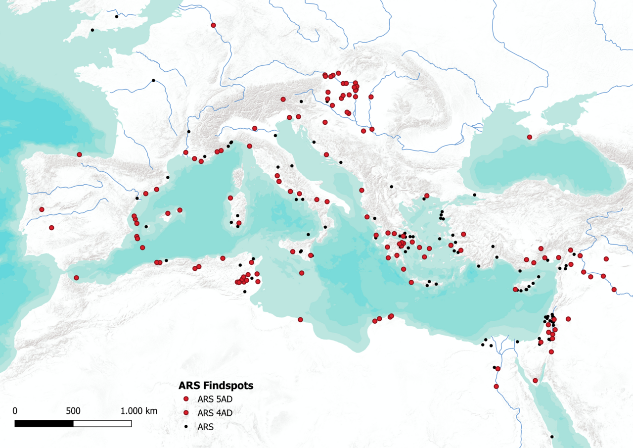
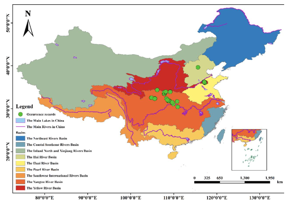
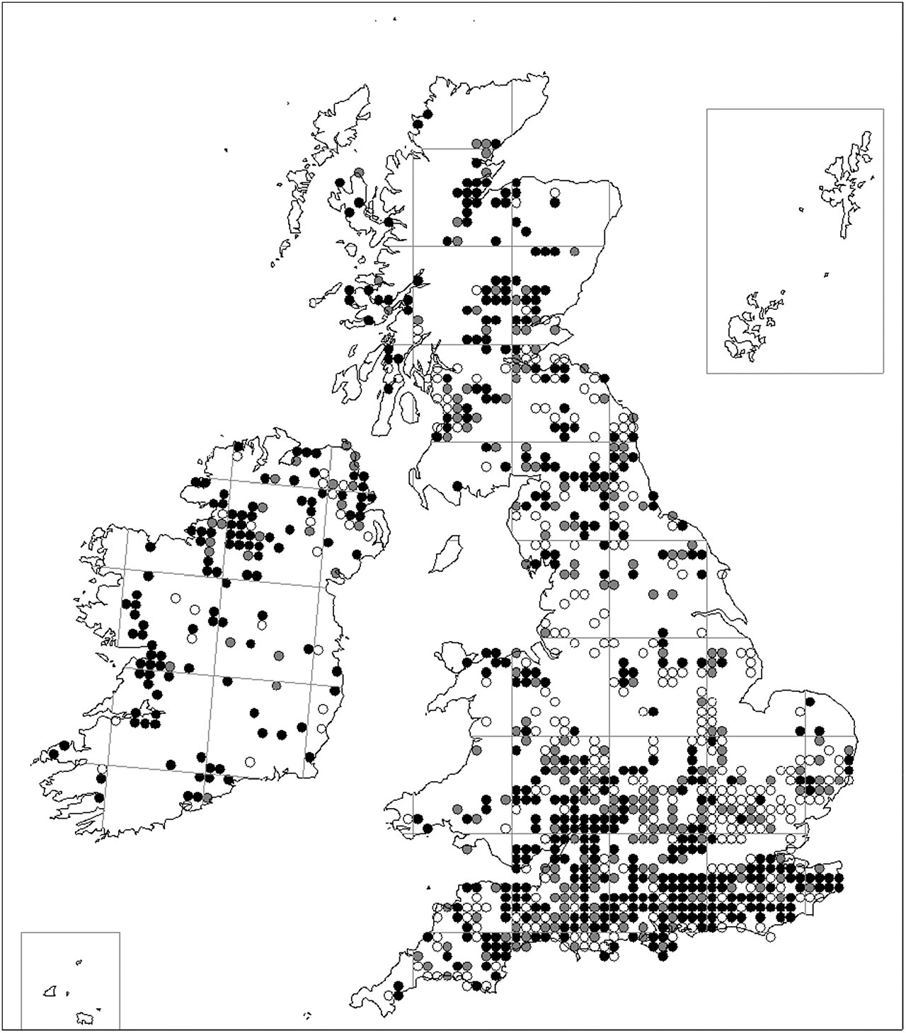
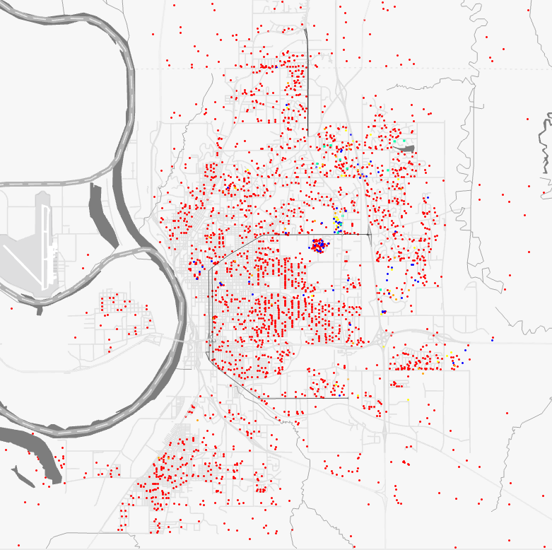
A dot distribution map (or dot density map or dot map) is a type of thematic map that uses point symbols to visualize the geographic distribution of a large number of related phenomena. It relies on a visual scatter to show spatial patterns, especially variances in density. The dots may represent actual locations of individual phenomena or be randomly placed in aggregation districts to represent a number of individuals.
- field
- Cartography, Thematic Mapping
- known_for
- Visualizing geographic distribution and density using point symbols
Lore & Background
The idea of using dots to show relative density emerged during the Industrial era in England and France in the 1830s and 1840s, enabled by increasing availability of statistical data. Snow recognized that a map was the most effective tool for communicating spatial patterns of disease.
Reader's Guide
Dot distribution maps are significant as one of the earliest forms of thematic mapping, developed alongside other modern map types in the 19th century. They enabled the visualization of large-scale phenomena such as population density and disease outbreaks, supporting spatial analysis and epidemiology. Two distinct types emerged: one-to-one maps showing actual locations of individual occurrences, and one-to-many maps using randomly placed dots derived from aggregate data. The latter can exhibit an ecological fallacy, as dots are evenly spaced within districts and do not represent actual locations. Despite being less prolific than other thematic maps due to the time needed to create them manually, dot maps were often considered accomplishments worthy of academic publication. Geographic information systems later automated dot placement, though results are often less satisfactory than manual crafting. Recent advancements include dasymetric mapping for more accurate dot placement, scaling dot maps at different zoom levels, and temporal interpolation for animation.
Did You Know?
- One-to-many dot maps can exhibit an ecological fallacy because dots are evenly spaced and do not represent actual locations of individuals.
Origins and Early Pioneers
The concept of using scattered points to convey geographic density emerged during a period of rapid thematic mapping innovation in the 1830s and 1840s, driven by the Industrial era's growing statistical data and scientific curiosity. However, the technique's roots stretch further back. In 1797, Valentine Seaman plotted individual yellow fever cases in New York City, a small-scale precursor that nonetheless marked a significant early use of mapping as an analytical tool in social science and epidemiology, even though his conclusions proved wrong. The first true district-based dot density map appeared in 1830, produced by Armand Joseph Frère de Montizon, a Franciscan friar who also worked as a schoolteacher and printer. His map of French population by département placed dots—each standing for 10,000 people—randomly within administrative borders. The method was essentially identical to what computers still perform today: calculate a count, scatter dots across the area, and let density speak for itself. The even spacing made it clear the dots were not actual addresses, illustrating what we now call an ecological fallacy.
The Cholera Connection and John Snow
Epidemiology served as a powerful catalyst for the point-symbol map throughout the mid-nineteenth century, particularly in the search for cholera's cause. Between 1820 and 1850, cartographers produced maps plotting every individual case in affected regions. Thomas Shapter's 1849 map of the 1832–1834 Exeter outbreak stood out for its use of distinct point symbols to differentiate cases across three separate years. Though Shapter never identified the underlying cause of the clusters he revealed, his work left a lasting imprint; John Snow later acknowledged it as an inspiration. When cholera struck London in 1854, Snow gathered case-by-case location data in Soho, applying early spatial analysis and contact tracing to implicate contaminated water. His 1855 report included a map stacking individual cases at house locations, making the concentration around the Broad Street Pump—and the gaps where alternative water sources existed—visually unmistakable. While historians sometimes overstate the map's direct role in ending the debate, Snow's insight that a map was the most effective way to communicate spatial disease patterns remains genuinely revolutionary.
Standardization and Cartographic Practice
Despite its early invention, the district-based dot density map languished for nearly three decades after Montizon's 1830 publication before being independently reinvented in 1859 by Thure Alexander von Mentzer, a Swedish Army officer. His map of population across Sweden and Norway used dots representing 200 residents each, based on the 1855 Census but clearly adjusted with additional knowledge of where people actually lived. In the decades that followed, dot maps were less commonly produced than other thematic map types, partly because hand-drawing them was labor-intensive; many were considered achievements worthy of standalone academic publication. A hybrid approach emerged in the early twentieth century, combining representative dots for rural areas with proportional circles for major cities. By the mid-twentieth century, the dot density method had been formalized into standardized design guidelines, making it a staple of cartography textbooks and a teachable technique for new mapmakers.
Modern Technology and Future Directions
The arrival of geographic information systems transformed dot map production by automating the placement of individual dots, though practitioners often note that computer-generated results can fall short of the carefully crafted manual versions. A more significant technological leap came with the availability of massive geocoded datasets—millions of social media posts, for instance—enabling visualizations of geographic distribution at unprecedented granularity. Recent methodological innovations push the technique further in several directions. Dasymetric mapping techniques now allow dots to be placed more accurately within zones rather than scattered uniformly. Scaling approaches adjust the rate of dots per person at different zoom levels, so the map remains informative whether viewed broadly or up close. Temporal interpolation has made it possible to animate dot maps, showing how distributions shift over time. These advances ensure that a technique born from hand-drawn ink in the nineteenth century continues to evolve alongside the data it represents.
Gallery

Frequently Asked Questions
Who is Dot distribution map?
It is a type of thematic map in cartography that plots individual point symbols across a geographic area to reveal where a large number of related phenomena are concentrated. Rather than shading regions, it relies on the visual scatter of dots to communicate spatial patterns and density differences.
What are Dot distribution map's powers/role?
Its core function is to make geographic distribution and density variances visible at a glance through the clustering or spreading of point symbols. The dots can mark actual individual locations or be randomly scattered within aggregation districts to stand in for a count of individuals.
More in Maps & Their Symbols 1-24
Elsewhere in the Maps & Their Symbols universe
Spotted an error? Know more?
This is a living reference — every entry is fact-audited, and reader corrections feed straight into our audit queue. Suggest an edit · See this site's audit record