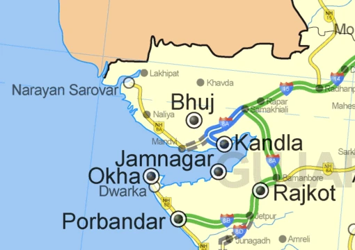
Proportional symbol map
Thematic map using symbol size to represent quantitative data.

A proportional symbol map (or proportional point symbol map) is a type of thematic map that uses map symbols varying in size to represent a quantitative variable. Typically, the area of each symbol is mathematically proportional to the variable, though indirect methods such as categorizing symbols as 'small,' 'medium,' and 'large' are also used. This technique is generally applied to point symbols, distinguishing it from cartograms and flow maps, though gray areas exist between these types.
- field
- Cartography / Thematic mapping
- known_for
- Using symbol size to represent quantitative variables on maps
Lore & Background
Arthur H. The technique was soon replicated and enhanced by other cartographers, including W. Charles Joseph Minard later produced several proportional symbol maps, innovating by using them to represent regions rather than points and incorporating color and statistical charts.
Reader's Guide
Proportional symbol maps are significant because they provide an intuitive way to represent quantitative variables spatially, with size being the visual variable most closely tied to a single interpretation: larger symbols represent more of something. The technique is complementary to choropleth maps, as it is best suited for spatially extensive variables (e.g., total population) that are problematic for choropleths. A key legacy is the Flannery Scaling Adjustment, derived from James J.
Did You Know?
- Proportional symbol maps are best suited for ratio variables that cannot include negative values, such as total population.
Size as the Defining Visual Variable
The proportional symbol map draws its communicative power from one of the most fundamental visual variables in cartography: size. Jacques Bertin, a French cartographer, formalized the concept of visual variables in his 1967 work Sémiologie Graphique, identifying seven principal categories including position, size, shape, value, color, orientation, and texture. Among these, size occupies a particularly privileged role in proportional representation. In practice, size most commonly governs how much space a point symbol occupies on a map or how thick a line symbol appears, but it also extends to area features when a cartogram scales regions in proportion to a given variable. Research has demonstrated that size is exceptionally effective at communicating quantitative data, making it the natural choice when a cartographer wants readers to perceive relative magnitudes at a glance. Because size has been shown to be very effective at conveying quantitative data, proportional symbol maps leverage this perceptual strength to transform abstract numbers into tangible, comparable visual elements. Since Bertin's foundational work, cartographers have continued to refine and expand the set of visual variables, yet size remains central to the proportional approach.
Cognitive and Semiotic Underpinnings
Understanding why proportional symbols communicate so effectively requires looking beyond the graphic mark itself. In earlier cartographic practice, mapmakers often treated the human brain as a black box, adopting a behaviorist stance that accepted symbols worked without questioning the underlying mechanism. Modern cartographers, by contrast, actively investigate the cognitive principles that explain why certain visual encodings succeed where others fail. This curiosity aims to build a theoretical foundation for how the brain recognizes and interprets symbols, which in turn provides a platform for designing new ones. Semiotics, particularly the framework of Charles Sanders Peirce, offers a structured way to describe this process. A map user reads a proportional symbol by forging a connection among three elements: the graphic mark on the page (the sign), a general or specific concept in the mind (the interpretant), and the particular real-world feature being depicted (the object or referent). Proportional symbols, by scaling area to represent a measured attribute, invite the reader to make a quantitative interpretive leap that purely iconic or conventional marks do not demand.
Spatial Phenomena and Dimensional Choices
Proportional symbol maps must contend with the fundamental question of what kind of spatial phenomenon they are representing. Geographers distinguish between objects—features recognizable as a unified whole with a relevant boundary and shape, such as buildings, cities, roads, lakes, and countries—and masses, where the notion of boundary and wholeness is not central to identity, as with air, water, vegetation, and rock. Mass phenomena are rarely depicted directly on maps; instead, their properties are portrayed as geographic fields, such as temperature, moisture content, density, or composition. The choice of geometric primitive for a proportional symbol depends on the dimensionality required to represent the phenomenon. Importantly, the dimensionality of the symbol need not match that of the real-world feature. Cartographic generalization, driven by purpose and scale, routinely compresses a three-dimensional road into a one-dimensional line or reduces a two-dimensional city to a zero-dimensional point. In proportional symbol work, this means the cartographer must decide whether a phenomenon is best captured as a point whose area encodes a value, a line whose thickness varies, or a region whose extent is scaled to a measured attribute.
Serving Multiple Purposes Simultaneously
A proportional symbol map is never a single-purpose tool. Cartographic symbols, by design, serve several functions at once. First and foremost, they declare the existence of a geographic phenomenon and show its location and extent. Beyond mere identification, they visualize attribute information, allowing readers to perceive not just where something is but what measurable property it carries. Equally important, symbols contribute to the aesthetic appeal of the map or deliberately evoke a particular look and feel, shaping the reader's aesthetic reaction. Finally, they establish an overall gestalt order that makes the map more or less useful, including the creation of a clear visual hierarchy that guides the eye from the most important features to secondary ones. In a proportional symbol map, the size variable does much of this heavy lifting: a large symbol immediately signals a high-value feature, establishing hierarchy while simultaneously encoding quantitative data. The interplay between size, color, shape, and other visual variables means that a single proportional symbol can declare existence, communicate a measured attribute, and slot itself into a visual hierarchy—all in one graphic gesture.
Frequently Asked Questions
What is Proportional symbol map?
It is a thematic cartographic technique in which point symbols on a map are sized so their area corresponds to a quantitative variable at each location. Rather than shading regions or drawing arrows, it encodes data magnitude directly into the footprint of individual symbols.
How does Proportional symbol map actually work?
Each symbol's area is calculated to be mathematically proportional to the value it represents, so a location with double the data gets a symbol with double the area. Some practitioners simplify this into discrete tiers—small, medium, large—when exact scaling feels visually cluttered.
Why is Proportional symbol map still important in cartography?
It offers a clean, location-specific way to display quantitative variation without needing areal boundaries, making it ideal for discrete points like cities, stations, or trade hubs. Its simplicity and flexibility have kept it a go-to choice in thematic mapping well over a century after its debut.
More in Maps & Their Symbols 1-24
Elsewhere in the Maps & Their Symbols universe
Spotted an error? Know more?
This is a living reference — every entry is fact-audited, and reader corrections feed straight into our audit queue. Suggest an edit · See this site's audit record