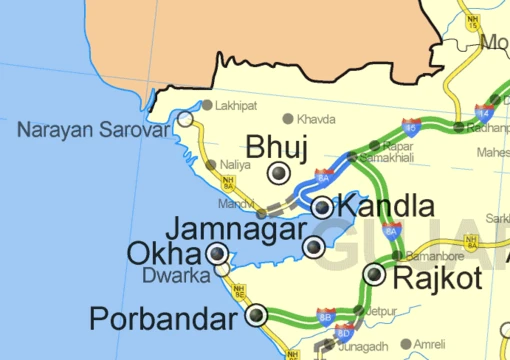
Heat map
A data visualization technique using color to represent magnitude.

Source 1: Own work based on: Basemap.png , Source 2: Copernicus programme · CC BY-SA 4.0
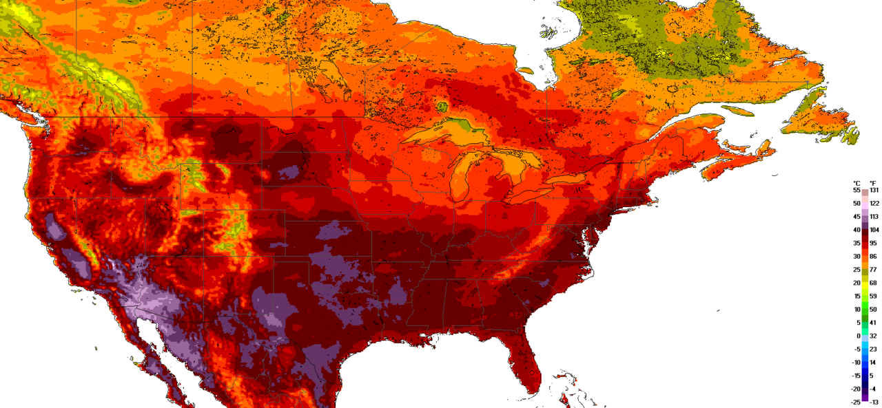
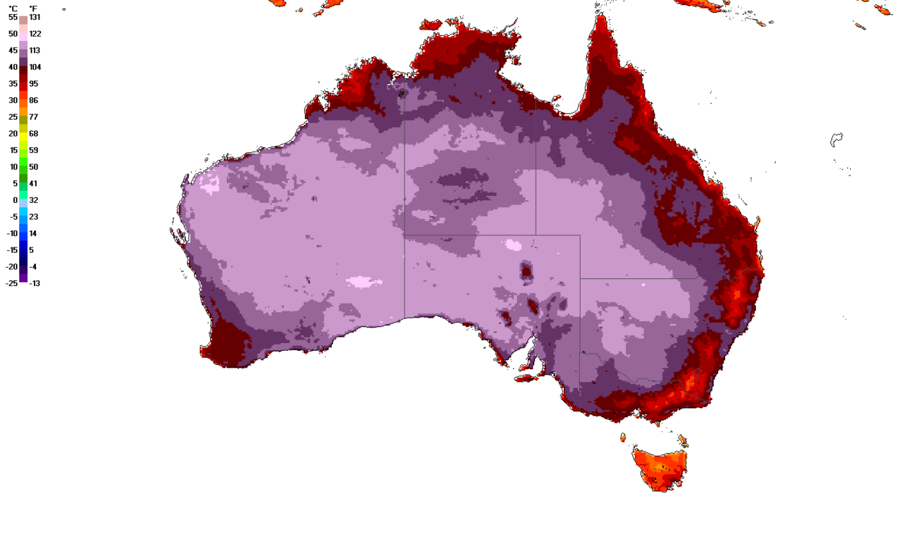
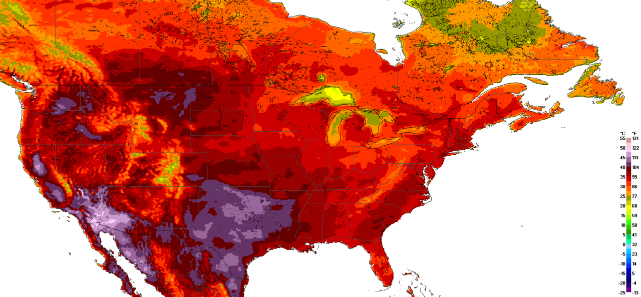
A heat map (or heatmap) is a two-dimensional data visualization technique that represents the magnitude of individual values within a dataset as a color. The variation in color may be by hue or intensity. In some applications such as crime analytics or website click-tracking, color is used to represent the density of data points rather than a value associated with each point. 'Heat map' is a relatively new term, but the practice of shading matrices has existed for over a century.
Lore & Background
Heat maps originated in 2D displays of the values in a data matrix. Larger values were represented by small dark gray or black squares (pixels) and smaller values by lighter squares. Ling used overstruck printer characters to represent different shades of gray, one character-width per pixel.
Reader's Guide
Heat maps have a wide range of possibilities amongst applications due to their ability to simplify data and make for visually appealing to read data analysis. They are used in business analysis to give a visual representation about a company's current functioning, performance, and the need for improvements. On websites, multiple types of heat maps—including mouse tracking, eye tracking, click tracking, AI-generated attention, and scroll tracking—are used together to determine user actions and page performance. In exploratory data analysis, heat maps allow data scientists to visualize relationships in high-dimensional space without becoming too compact. In biology, heat maps visually represent patterns in DNA, RNA, and gene expression, aiding communication with non-specialists. In financial analysis, heat maps enable users to visualize data points and compare performers. In geographical visualization, heat maps display the geographic distribution of data, showing densities and intensities. In sports, heat maps help identify patterns and inform coaching decisions. In cybersecurity, heat maps are also used. The two primary categories are spatial heat maps (displaying magnitude of a spatial phenomenon as color over a map) and grid heat maps (displaying magnitude as color in a two-dimensional matrix). Grid heat maps are further categorized into clustered heat maps and correlograms.
Did You Know?
- A correlogram is a clustered heat map that has the same trait for each axis and is displayed as a triangle instead of a square.
Gallery
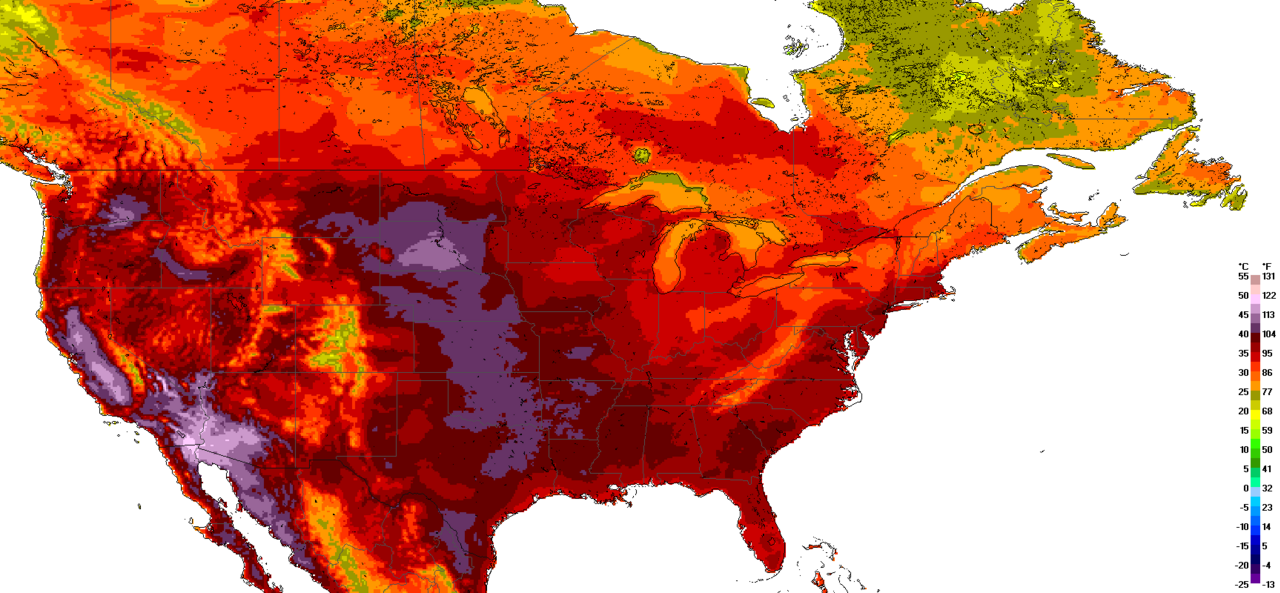
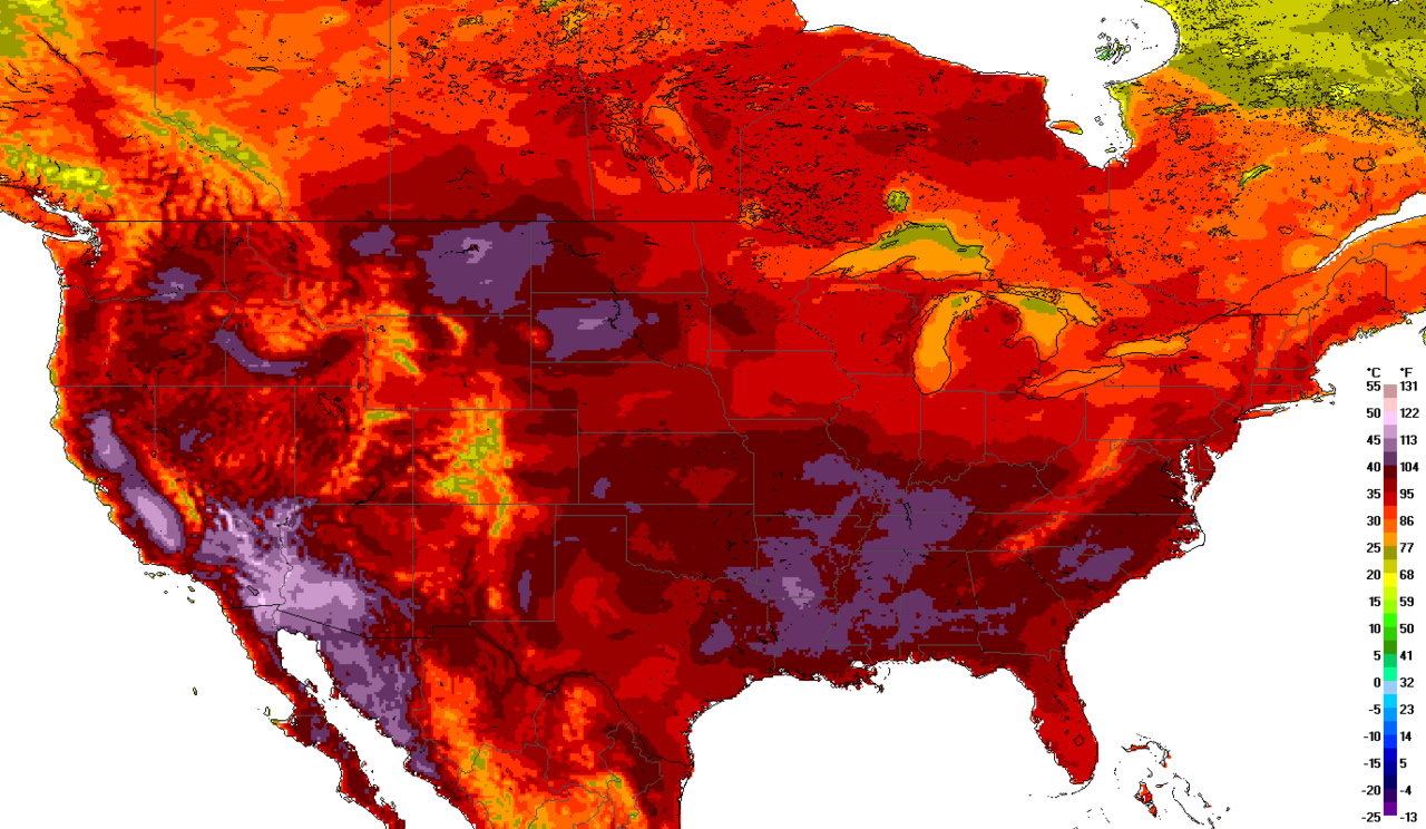
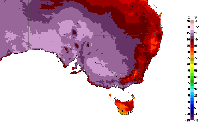
Frequently Asked Questions
Who is Heat map?
Heat map is a two-dimensional data visualization method that translates the magnitude of values in a dataset into color. It can vary by hue or intensity to convey differences in magnitude across the matrix.
What are Heat map's powers/role?
Its core function is encoding data magnitude as color, but in fields like crime analytics or website click-tracking it shifts to representing the density of data points rather than a single value per cell.
Why is Heat map important?
It offers an intuitive, at-a-glance way to perceive patterns across a matrix of values, making it indispensable in fields ranging from genomics to urban planning. Its century-plus heritage of matrix shading shows how deeply embedded this visual logic is in data analysis.
More in Maps & Their Symbols 1-24
Elsewhere in the Maps & Their Symbols universe
Spotted an error? Know more?
This is a living reference — every entry is fact-audited, and reader corrections feed straight into our audit queue. Suggest an edit · See this site's audit record